Thursday, 24 April 2014

Tasty 6 Research- OUGD503


The Brief:
Name to incorporate in the logo
Tasty6
Slogan to incorporate in the logo
“Delicioussupernutritious” (not a typo!)[or alternatively “Delicious”&” Supernutritious”] & “Pure Power”. However, should you come up with a powerful logo without the slogan, then we’d be happy to see it as well.
Description of the organization and its target audience
Tasty6 is a new healthy performance food company. We provide organic, daily fresh, locally sourced, raw, unpasteurized, cold-pressed juices and foods to support people’s wellbeing and balance while on-the-go - with zest, hence Tasty6. Through our products people can connect with the experience our true essence – fresh taste with functionality, super nourishing. Our juices and foods are designed by marrying modern Western nutritional science with the over 5,000 year-old healing science approach of Ayurveda from India. The “6”in Tasty6 comes from the Ayurvedic approach that a food should represent all 6 tastes (sweet, sour, salty, astringent, bitter and pungent) to be well balanced and satiating. Our focus is on delicious, fresh, organic, super-nutritious, powerful performance & functionality in sync with our intent to achieve balance, presence, healing all the while not taking ourselves too seriously and having fun at it. Hence Tasty6 - nourishment for the body, so that the mind and spirit can thrive. We are based in a large metropolitan area on the U.S. East Coast.
Our key product messages are: 
Delicious, Super-Nutritious, Powerful Performance, Vibrant, Energized, Healing, Alive. Our key product attributes are: Organic, Fresh, Locally Sourced (when available), Great Taste/Delicious, packed with Super-Nutrients, Balanced.
Industry
Food & Drink

Values to communicate
  • FeminineMasculine
  • YoungMature
  • LuxuryEconomical
  • ModernClassic
  • PlayfulSerious
  • LoudQuiet
  • SimpleComplex
  • SubtleObvious
Color preferences
Blue, Green, Yellow, Gray, Red, Orange, White, Purple - any of those or a combination thereof
To be used on
  • Print (Business cards, letterheads, brochures etc)
  • Online (Website, online advertising, banner ads etc)
  • Merchandise (Mugs, T-shirts etc)
  • Signs (Including shops, billboards etc)
Notes
What we need to convey in the logo and style is that at Tasty6 - we’re the urban solution for healthy food on the go. We provide cold-pressed functional juices and foods not only for the converts but also for professionals that aspire to eat healthier but just don't have the time to prepare healthy meals. We are our own customers. Busy professionals that wish they could eat better, more balanced and nutritious foods to nourish our essence - but have little or no time to shop and prepare it themselves. We don't expect to replace, but supplement peoples daily nutrition to help them achieve a more balance diet so that their body and mind can perform better. We invite and support people to make the best nutritional choices, to achieve their best performance while healing and balancing the body, mind and spirit.
This is the first step towards a whole brand identity. The name Tasty6 has it's origins in the following: Our products (juices/foods) marry western nutritional science and functionality with the over 5,000 year old Indian Healing Science of Ayurveda. According to Ayurveda, a meal that includes all six tastes (sweet, salty, sour, bitter, astringent, pungent) is needed to represent a well balance meal, be fully satiating, and reduce cravings.
This product (and logo) is intended to convey that we're top notch - great ingredients, delicious taste. However, it is our intention to marry the seriousness and high quality of the product with a certain playfulness/sexiness as the name "Tasty" and the slogan "Delicioussupernutritious"/"Delicious & Supernutritious" & “Pure Power” imply.
For future development of the brand identity it is important that the designer note that "6" is an important number at the base of our whole concept. In the logo it can be represented as the Number "6" or written out as "Six". 6 taste/ 6 functions/ 6 characters on the name (TASTY6). We truly believe this differentiates us from the rest! And we love it! We need a logo to match.
We will initially do 6 juices, which will be specifically tailored to 6 functionalities based on the nutrients' functionality. For example "Immunizer", "Glow", "Stamina" etc... Our product will be sold in very busy retail intersections of a large urban city so the logo and functionalities need to be easily understood visually as people pass us on the way to work. We will also afterwards need simple icons for the 6 main functionalities. This is the first step in subsequent label design and package design.
One idea is to use 6 colors for the logo of the word tasty6 – which later on each color will then be used as one of the 6 functions’ icon colors. Or the logo could be cleaner but each label could be colored. In any case we are completely open to let designers be free, creative, urban, modern and unique with the logo.


Required file types

Layered vectors in EPS & PDF
Screen quality JPEG & PNGs
Note: Text in logos should be converted to outlines. Fonts used will be detailed by the designer but are not provided for licensing reasons.


Looking into designs that have inspired the contest already...

Captain John packaging Galya Akhmetzyanova Pavla Chuykina Captain John packaging by Galya Akhmetzyanova & Pavla Chuykina
Captain John packaging Galya Akhmetzyanova Pavla Chuykina 03 Captain John packaging by Galya Akhmetzyanova & Pavla Chuykina
Strong design aesthetics that follow trough the design of each product creates a solid brand identity. This particular brand is quirky and unique so will be accepted to be sold as a high-end brand. The dark wood and cleanly executed design creates an essence of luxury.
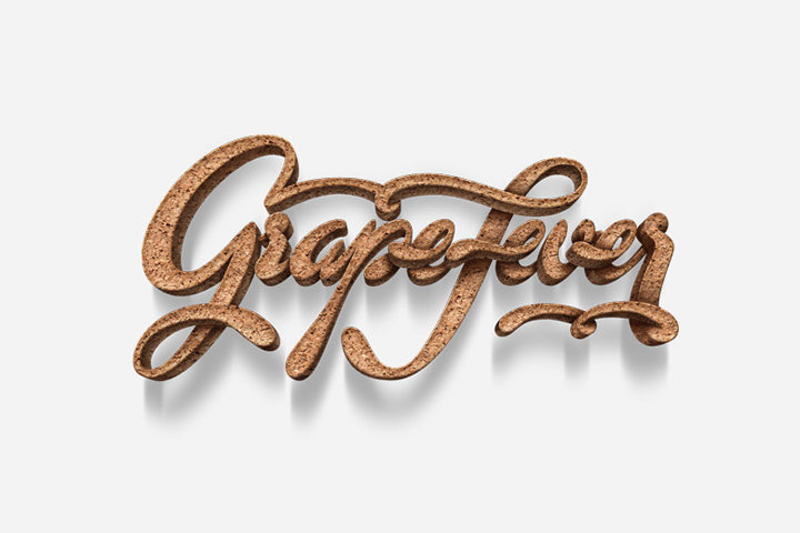
GrapeFever branding by Workflock 02 GrapeFever branding by Workflock
Although not a fan of the design myself, the contest have given this as a piece of inspiration. I appritiate the difference in levels between letters however feel that the texture of the cork along with the calligraphic qualities appears visually confusing and to a degree, not readable or legible.


https://www.behance.net/gallery/WOOOING-Brand-Design/15196713

The simplicity of these vector image infographics captured my attention as they don't quite make sense standing alone unless put into context. 


https://www.behance.net/gallery/SOCAR-Corporate-Identity-Design/9855717

Again, simple and quirky but easier to understand than the previous design.


....

No comments:

Post a Comment