Thursday 24 April 2014

Makerwear research - OUGD503

The Brief:


Clothing or apparel to design
Bag
Apparel description and purpose
MakerWear is a developer of apparel and accessories. Our core audience for this contest is GIRLS ages 6-10. Designs are for both Hats & Totes.


Requirements
1) Please provide your art in vector files if possible2) Limit
your images to the crown of the hat, the bill/visor of the hat, and
please avoid having your art "bleed" across both the crown and bill.3)
Please limit your art to the main panel of the tote; avoid art covering
the handles/straps; avoid your art "bleeding" across the seams of the
tote's main panel.
Style/theme ideas for the clothing or apparel
We are looking for fun, bold, inspirational designs for GIRLS Baseball Caps, Trucker Hats, and Totes for the theme FLORAL LETTERING. Think clean and bold composition infused with floral patterns and lettering. The floral pattern can be incorporated as a background for block typeface or can be used in the type itself. Use inspiring words and phrases like ‘Day Dreamer’ ‘Beauty’ ‘Charming’ ‘Elegant’ etc. Use pastel floral patterns or bright florals. The lettering can be in black, white, metallic, or a color you think compliments the floral pattern. All designs submitted must be 100% original and trademark free to be considered.


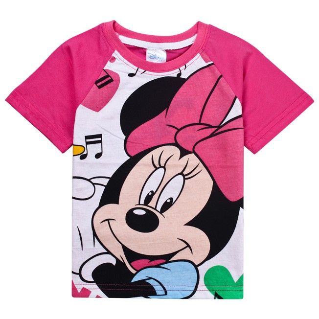
These tshirts are heavily based on use of colour and appear very feminine. The fonts used mimic hand writing to the target age range so that words are easily readable and understood as this is related to hand writing. 


This t-shirt in black and white doesn't appear as feminine however still has friendly, positive tones.

The use of too much colour will bleed over onto the areas specifiec in the brief not not do so and a large scale design will do the same. If I design to a specific area or shape this will in-keep with the brief guidelines.

Anahata research - OUGD503


The Brief:
Organization name
Anahata Living
Description of the organization and its target audience
Anahata Living sources natural beauty and skincare products from Bali. Its products are handmade, 100% natural, sustainably grown and traditionally inspired. Anahata Living's tagline is "from the heart" - so the brand is about connecting from deep within ourselves and realising our personal power, through making ethical choices that are good for ourselves and good for those around us as well as the environment. Its target audience is females between 25-45 with disposable income, who are into yoga, healthy eating and healthy living.
Industry
Cosmetics & Beauty
Description
I need labels for 6 types of products and their samples. They should all have the same look and feel. You may submit a design for one type of label first - either body lotion, body butter or body mist/bug/mat sprays. If I like the look and feel of the design, we can move on to do the other products.
The dimensions are as follows:
Products:
1. Body Lotion (white bottle - see Utama Spice picture):
Height : 6.5 cm
width : 12 cm
2. Body Butter (white round tub - see Utama Spice picture):
Top diameter : 7.5 cm
Bottom diameter: 5.5 cm
3. Lip Balm (white tube - see Utama Spice picture):
Height : 4 cm
width : 5.5 cm
4. Body Mist Spray (clear transparent bottle with neon spray top cap - see Angelo picture):
Height: 6.5cm
Width: 10.5cm
5. Bug Spray (clear transparent bottle with neon spray top cap - see Angelo picture):
Height: 6.5cm
Width: 10.5cm
6. Mat Spray (clear transparent bottle with neon spray top cap - see Angelo picture):
Height: 6.5cm
Width: 10.5cm
Samples:
Body Lotion, width : 10cm, height : 4cm (see attached Green leaf body lotion sample picture)
Body Butter 5cm diameter (top only) (white round tub, just as the normal sized version)
Body Mist, Bug Spray, Mat Spray: height: 5cm, width: 5cm (see attached Angelo picture)
I have attached pictures of the bottles/containers to be used, as well as my company logo (Anahata Living) and tagline (from the heart). The look and feel should should be light, airy, hippie, chic, cool and in keeping with my company logo, clean and modern. Background should be white. Each product should feature:
1) name of the product, e.g. Body Butter
2) the flavour e.g. Tangerine 
3) the ml content or weight, e.g. 60ml or 100g
4) a stamp saying "100% Natural" and "Handmade in Bali"
5) Product description, e.g. "This is a bold blend of tropical and citrus extracts in an aloe vera based moisturiser, to bring out your youthful vibrant skin.
6). Company Brand description, e.g. "Anahata Living sources natural beauty and skincare products from Bali. Its products are handmade, 100% natural, sustainably grown and traditionally inspired."
7) Product ingredients list (I will provide this separately)
8) Product warnings: For external use only. Avoid contact with eyes. Store in a cool and dry place.
9) My website name http://www.anahata-living.com
10) Set aside space for a bar code (but there won't be any bar codes at this point)
For the samples, it is enough for it to have
1) name of the product, e.g. Body Butter
2) the flavour e.g. Tangerine 
3) the ml content or weight, e.g. 60ml or 100g
4) a stamp saying "100% Natural" and "Handmade in Bali"
For the lip balms, please see pictures of the Utama Spice lip balms to know what info I need on the lip balms.
I will give updated product descriptions, company brand descriptions and ingredients lists separately. Please just work on the look and feel for each product first, and set aside the necessary space for each item of information on the label.
Notes
You may submit a design for one type of label first - either body lotion, body butter or body mist/bug/mat sprays. If I like the look and feel of the design, we can then move on to do the other products


So to create the initial idea for the aesthetic of this brand, I need to look at other label designs for natural skin products... The brief states that: you may submit a design for one type of label. With this in mind I have decided to create a label for body butter. first to experiment with circular label design as I usually find this shape difficult to design in.


The design above explores a bohemian yet high end and quality identity. The contrast between black and off white is equally balanced with the botanical style sketches. Cleanly executed however I think this is a little to minimal for what ANAHATA are asking for.


Click for enlarged viewClick for enlarged viewBlueberry Body Butter
The body shop take a very photographic approach with their products such as the body butters shown above. The idea clearly illustrates the 'flavour' of the product and information of the leader label is very minimal.


Another product from the body shop however this label contains more information about the product. The vector illustrations are amusing and more personal than photography for the customer to relate/empathise with.
Body Butter
Presented in a tin, the cotswold, lavender body butter is automatically given an all natural feel. The use of photographs here again however more information is displayed on the label to inform the customer about the product.

Palmers body butter label is printed directly onto the container rather than a label to match the background to container colour.


Cotton Tree Body Butter with Coconut  200g
This label looks very dated with orange/brown hues and desaturated photography. again, minimal information and clear use of the brand logo.


Looking at body butter packaging labels as an example, I need to consider the audience for the brand too...

females between 25-45
 with disposable income
into yoga
healthy eating
healthy living

The idea of this audience instantly springs 'BOHEMIAN' to mind.


After a quick mind map, I decided it was best to just begin with the development!


Tasty 6 Research- OUGD503


The Brief:
Name to incorporate in the logo
Tasty6
Slogan to incorporate in the logo
“Delicioussupernutritious” (not a typo!)[or alternatively “Delicious”&” Supernutritious”] & “Pure Power”. However, should you come up with a powerful logo without the slogan, then we’d be happy to see it as well.
Description of the organization and its target audience
Tasty6 is a new healthy performance food company. We provide organic, daily fresh, locally sourced, raw, unpasteurized, cold-pressed juices and foods to support people’s wellbeing and balance while on-the-go - with zest, hence Tasty6. Through our products people can connect with the experience our true essence – fresh taste with functionality, super nourishing. Our juices and foods are designed by marrying modern Western nutritional science with the over 5,000 year-old healing science approach of Ayurveda from India. The “6”in Tasty6 comes from the Ayurvedic approach that a food should represent all 6 tastes (sweet, sour, salty, astringent, bitter and pungent) to be well balanced and satiating. Our focus is on delicious, fresh, organic, super-nutritious, powerful performance & functionality in sync with our intent to achieve balance, presence, healing all the while not taking ourselves too seriously and having fun at it. Hence Tasty6 - nourishment for the body, so that the mind and spirit can thrive. We are based in a large metropolitan area on the U.S. East Coast.
Our key product messages are: 
Delicious, Super-Nutritious, Powerful Performance, Vibrant, Energized, Healing, Alive. Our key product attributes are: Organic, Fresh, Locally Sourced (when available), Great Taste/Delicious, packed with Super-Nutrients, Balanced.
Industry
Food & Drink

Values to communicate
  • FeminineMasculine
  • YoungMature
  • LuxuryEconomical
  • ModernClassic
  • PlayfulSerious
  • LoudQuiet
  • SimpleComplex
  • SubtleObvious
Color preferences
Blue, Green, Yellow, Gray, Red, Orange, White, Purple - any of those or a combination thereof
To be used on
  • Print (Business cards, letterheads, brochures etc)
  • Online (Website, online advertising, banner ads etc)
  • Merchandise (Mugs, T-shirts etc)
  • Signs (Including shops, billboards etc)
Notes
What we need to convey in the logo and style is that at Tasty6 - we’re the urban solution for healthy food on the go. We provide cold-pressed functional juices and foods not only for the converts but also for professionals that aspire to eat healthier but just don't have the time to prepare healthy meals. We are our own customers. Busy professionals that wish they could eat better, more balanced and nutritious foods to nourish our essence - but have little or no time to shop and prepare it themselves. We don't expect to replace, but supplement peoples daily nutrition to help them achieve a more balance diet so that their body and mind can perform better. We invite and support people to make the best nutritional choices, to achieve their best performance while healing and balancing the body, mind and spirit.
This is the first step towards a whole brand identity. The name Tasty6 has it's origins in the following: Our products (juices/foods) marry western nutritional science and functionality with the over 5,000 year old Indian Healing Science of Ayurveda. According to Ayurveda, a meal that includes all six tastes (sweet, salty, sour, bitter, astringent, pungent) is needed to represent a well balance meal, be fully satiating, and reduce cravings.
This product (and logo) is intended to convey that we're top notch - great ingredients, delicious taste. However, it is our intention to marry the seriousness and high quality of the product with a certain playfulness/sexiness as the name "Tasty" and the slogan "Delicioussupernutritious"/"Delicious & Supernutritious" & “Pure Power” imply.
For future development of the brand identity it is important that the designer note that "6" is an important number at the base of our whole concept. In the logo it can be represented as the Number "6" or written out as "Six". 6 taste/ 6 functions/ 6 characters on the name (TASTY6). We truly believe this differentiates us from the rest! And we love it! We need a logo to match.
We will initially do 6 juices, which will be specifically tailored to 6 functionalities based on the nutrients' functionality. For example "Immunizer", "Glow", "Stamina" etc... Our product will be sold in very busy retail intersections of a large urban city so the logo and functionalities need to be easily understood visually as people pass us on the way to work. We will also afterwards need simple icons for the 6 main functionalities. This is the first step in subsequent label design and package design.
One idea is to use 6 colors for the logo of the word tasty6 – which later on each color will then be used as one of the 6 functions’ icon colors. Or the logo could be cleaner but each label could be colored. In any case we are completely open to let designers be free, creative, urban, modern and unique with the logo.


Required file types

Layered vectors in EPS & PDF
Screen quality JPEG & PNGs
Note: Text in logos should be converted to outlines. Fonts used will be detailed by the designer but are not provided for licensing reasons.


Looking into designs that have inspired the contest already...

Captain John packaging Galya Akhmetzyanova Pavla Chuykina Captain John packaging by Galya Akhmetzyanova & Pavla Chuykina
Captain John packaging Galya Akhmetzyanova Pavla Chuykina 03 Captain John packaging by Galya Akhmetzyanova & Pavla Chuykina
Strong design aesthetics that follow trough the design of each product creates a solid brand identity. This particular brand is quirky and unique so will be accepted to be sold as a high-end brand. The dark wood and cleanly executed design creates an essence of luxury.
GrapeFever branding by Workflock 02 GrapeFever branding by Workflock
Although not a fan of the design myself, the contest have given this as a piece of inspiration. I appritiate the difference in levels between letters however feel that the texture of the cork along with the calligraphic qualities appears visually confusing and to a degree, not readable or legible.


https://www.behance.net/gallery/WOOOING-Brand-Design/15196713

The simplicity of these vector image infographics captured my attention as they don't quite make sense standing alone unless put into context. 


https://www.behance.net/gallery/SOCAR-Corporate-Identity-Design/9855717

Again, simple and quirky but easier to understand than the previous design.


....

Friday 11 April 2014

Nothing but Wine Research- OUGD503


The Brief:
Name to incorporate in the logo
Nothing But Wine
Slogan to incorporate in the logo
None specified
Description of the organization and its target audience
Wine Blog
Write about wine, provide links to wine websites, write about wine accessories
Industry
Retail
Preferred logo types
Sample logos
None specified
Values to communicate
  • FeminineMasculine
  • YoungMature
  • LuxuryEconomical
  • ModernClassic
  • PlayfulSerious
  • LoudQuiet
  • SimpleComplex
  • SubtleObvious
Color preferences
Yellow, Blue, Orange, Grey, White
To be used on
  • Print (Business cards, letterheads, brochures etc)
  • Online (Website, online advertising, banner ads etc)
Notes
None specified


Contest deliverables

  • Logo design
All contest submissions should only include a logo design.

Handover deliverables

  • Business card
  • Letterhead
  • Envelope
  • Facebook cover image
The winning designer will create these deliverables during contest handover.

Payment methods

This contest has been pre-paid with 99designs. The winner will be paid directly by 99designs for the full prize amount, excluding any third party transfer fees.


As I have developed an interest into branding and identity, This brief will allow me to explore this a little further. Firstly I need to get a ground basis upon which to begin designing...


The Top 10 UK Wine blogs was last updated 15/11/2012:


From first glance, Spittoon doesn't particularly look like a wine specialist blog however offers some interesting information. The simplistic greyscale aesthetic doesn't offer any 'flavour' to the audience however this minimalist approach visually leads the audience to the content... much the point of a blog.


Again, another minimal approach, perhaps to an older audience, more mature wine enthusiasts than those who choose to visit Spittoon? The simple layout on the page is easy to navigate and there is no logo or identity as such, just 'jamie goode's wine blog' clear as day and straight to the point.


A genuine person who sees the fun side to blogging. The personality of the lady blogging for 'Knackered mothers Wine club' is clearly apparent throughout her blog in visual imagery to the informality of the body copy. I personally found this the most interesting blog to read as it's on such a personal level.


A mature blog looking at the 'good stuff' in life...Wine? Again, a grey scheme blog but appearing more to a female audience with the photograph of the blogger, hand writing headers and light weight, friendly fonts. 'The Wine Sleuth' appears more to an female audience between 35-50 years and still offers just as much information as say, Jamie goode's blog but not as easily navigable.  


As the brief is asking for purely a logo design, I began to look at wine logos...

creative wine logo
creative wine logocreative wine logo
creative wine logo

The logos above are very simplistic and cleanly executed however the brief asks for an obvious, playful and luxurious aesthetic to appear in the logo so I was then interested in how this can extenuate the brand in a more personal yet 'high-end' manner...

creative wine logo
creative wine logo
Wine Labels - Illustration by Alessandro Maffioletti

The logos above are all hand drawn or traditionally printed using various tectniques. This approach seems more fitting to the logo wanted and the aesthetics that have been asked to match up.


Development for my response to the brief::

http://d-yearsley1215dp.blogspot.co.uk/