As designers we have to be aware of the function of our work and design as much as we care about the aesthetics and visuals. There are a lot of terms for the design of how the site functions and works, from “usability design” to “user experience,” what remains constant is that if we want to become better designers we have to pair these two concepts together.
The Rule of Thirds
 The rule of thirds is a method of composing elements to be visually pleasing in addition to identifying ways that users eyes will scan across the page. Photographers have been using this principal for years to create more visually interesting compositions.
The rule of thirds is used by breaking up a design into thirds both vertically and horizontally. This builds a grid of intersecting lines. The rule states that a viewer is more likely to be drawn to the intersection of those lines. Additionally it is a good rule of thumb to place elements along the lines and intersections as well as avoid placing anything in the dead center of the composition or have a horizon diving the composition in half.
Placing elements so that they take up 1/3rd or 2/rds of the space will be more visually pleasing to most viewers.
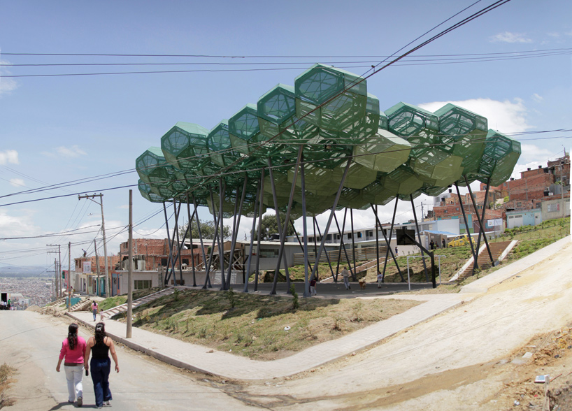
By changing environment and situation mood, behaviour and emotion is possible to affect.

By transforming a learning environment from say, a classical library to the library below, people will be uplifted by the lightness, space and positive


http://www.stark1200.com/library.html
Possible uses:
-
-
-
-
-


AFFECT AND DESIGN
In the early days of the personal computer, all the display screens were black and white. When color screens were first introduced, I did not understand their popularity. In those days, color was primarily used either to highlight text or to add superfluous screen decoration. From a cognitive point of view, color added no value that could not be provided with the appropriate use of shading. But despite the fact that the interface community could find no scientific benefit, businesses insisted on buying color monitors. Obviously, color was fulfilling some need, but one we could not measure. In order to understand this phenomenon, I borrowed a color display to use with my computer. After the allocated time, I was convinced that my assessment had been correct -- color added no discernible value for everyday work. However, I refused to give up the color display. Although my reasoning told me that color was unimportant, my emotional reaction told me otherwise.
The "usable but ugly" critique of The Design of Everyday Things has merit insofar as usable designs are not necessarily pleasurable ones. As my story of the three teapots indicates, pleasurable designs are not necessarily usable. But need these attributes be in conflict? Why not beauty and brains, pleasure and usability? When I wrote The Design of Everyday Things, my intention was not to denounce beauty. I simply wanted to position usability in its proper place in the design world: equal to beauty, equal to function: equal, but not superior. I neglected the topic of aesthetics because I thought it already well covered elsewhere. Unfortunately, my neglect was interpreted by many to imply that I was against beauty, for usability at all costs.
The field of usability design takes root in the cognitive sciences -- a combination of psychology, computer science, human factors, and engineering. These are all analytical fields. The discipline prides itself on its scientific basis and experimental rigor. The hidden danger is to neglect areas that are not easily addressed in the framework of science and engineering.
The tensions between aesthetics and usability as well as those between affect and cognition have long bothered me, but it has not been until now that I have been able to make progress in bringing these areas together.
Affect and emotion are not as well understood as cognition, but the cognitive and neurosciences have made major strides in the past decade. Note that terminology is still a problem, so in this paper, to avoid the technical debate about distinctions among the concepts of affect, emotion, feelings, mood, motivation, and qualia, I use the reasonably neutral term of "affect." Affect and cognition can both be considered information processing systems, but with different functions and operating parameters. The affective system is judgmental, assigning positive and negative valence to the environment rapidly and efficiently. The cognitive system interprets and makes sense of the world. Each system impacts the other: some emotions -- affective states -- are driven by cognition, and cognition is impacted by affect.
The surprise is that we now have evidence that pleasing things work better, are easier to learn, and produce a more harmonious result.
In the 1950s prizewinning biologist and doctor Jonas Salk was working on a cure for polio in a dark basement laboratory in Pittsburgh. Progress was slow, so to clear his head, Salk traveled to Assisi, Italy, where he spent time in a 13th-century monastery, ambling amid its columns and cloistered courtyards. Suddenly, Salk found himself awash in new insights, including the one that would lead to his successful polio vaccine. Salk was convinced he had drawn his inspiration from the contemplative setting. He came to believe so strongly in architecture’s ability to influence the mind that he teamed up with renowned architect Louis Kahn to build the Salk Institute in La Jolla, Calif., as a scientific facility that would stimulate breakthroughs and encourage creativity.
http://www.scientificamerican.com/article/building-around-the-mind/
We can apply this to graphic design and the organisation of space used to affect someone's emotion and behaviours.
http://www.scientificamerican.com/article/building-around-the-mind/
We can apply this to graphic design and the organisation of space used to affect someone's emotion and behaviours.
Graphic design moves on an incredible distance from print in various circumstances. For example an exhibit may need information and way-finding designed however other ideas then come into play to tie together product and event such as initial sketches for the proposal of ideas then merge with say; architecture for example to create unique buildings and landscapes.

Initial ideas:
- Psychological effects of graphic design
- How graphic design can be pushed
- Bending the boundaries of graphic design
- Would public touch screens be used more is the design was different? e.g less corporal and intimidating
Activist: An activist approach is defined as the measures of taking steps to make a change. This involves implementing new rules and guides to change the previous regime or system.
Design is most effective when executed with knowledge of psychology. Knowing how people react to visual stimuli allows the crafting of an effective design, with out psychology you are guessing.
http://3.7designs.co/blog/2012/08/10-psychological-principles-to-design-with/
These incredibly intricate 3D paper info graphics are creating quite a buzz on many of the key graphic blogs. Pattern Matters is the creator of some stunning posters and paper-sculptured artworks. The Stylesight graphics team love the visual pattern work within the mind-blowing paper cut calendars.


Pattern Matters is a graphic design-based project looking at possible ways to augment the role of pattern by looking into the design process and tactile exploration through pattern making.

No more empty walls to stare at. Add a dash of chic to the walls and bring the living spaces alive with a stylish ambience. And promising to facilitate it for you, Ego Wall Décor have for the first time brought to the country, Mr.Perswall, a customisable digital wall covering brand.


http://www.lm3labs.com/museum/page/2

http://ayraid.blogspot.co.uk/
Digital flooring is an element that could push advertising to a new level.

Anna Richardson Taylor explores the importance of an understanding of psychology when it comes to design
What does the World Wide Fund for Nature’s logo have in common with a jar of Waitrose Honey? They both use a stylised image of an animal, and are examples of simple yet effective design. They are also both neat practical applications of the psychological theories of Gestalt.
Developed by German psychologists in the 1920s, Gestalt theories explain how people tend to organise visual elements into groups, and how the whole is often greater than its parts. Their application takes advantage of how the brain self-organises information in a manner that’s orderly, regular, symmetrical and simple. Used in a logo, the Gestalt principles make it more interesting, more visually arresting – and therefore the message more memorable.
Whether this only vaguely rings a distant bell of your design education, Gestalt and other psychological hypotheses – such as colour theory or semiotics – are still very much in evidence in today’s creative industries.


For a recent campaign for beer brand Birra Moretti, Aesop designed a series of press adverts that featured an archive image of a women looking directly at the viewer. The image and composition were chosen instinctively by the designers, says Ed, but they still use the psychological effect of the direct gaze that makes the viewer more responsive.

Paul Davies, who was a psychologist before becoming a designer, runs psychology-led design consultancy Behaviour, also believes that an understanding of behaviour can make design more effective. “Psychology has a huge impact,” he argues. “Unlike artists, designers have to make something for effect; an artist can start a project without a brief, but a designer has to have a purpose and they have to do that for a particular audience.”
Paul believes this is becoming particularly important as design gets increasingly used to effect positive behavioural changes. For a recent project for breast cancer charity CoppaFeel, Behaviour was asked to design a tool for young women to get into the habit of regularly checking for early signs of breast cancer.
Even creating pieces of design that are used to substitute areas that would otherwise be plain and simple in order for the audience to view a public area differently will have effect on emotion and understanding.
Most of the recognisable logos we see everyday aren’t the colour they are because the designers liked it. Colours are chosen very carefully to have a psychological effect on a person when they see it. Companies like Facebook will go through hundreds of shades of blue just to get the colour that has the most impact and is most recognisable.
Colours can also have a psychological effect and can even change the mood your in. Blue may be the most popular colour in the world when it comes to logos – especially in tech companies. Facebook, Twitter, Skype, IBM, LinkedIN and many more all use different shades of blue. The colour gives off an authoritative but calm effect.
Check out the infographic to get a better understanding of colour psychology in logo design
.................................................................................................................................................................
Feedback...
After a feedback session presenting my proposal, I got positive feedback and have concluded that in order to allow myself much needed time, I need to pin point the space in which I want to create an interactive impact.

Interactive space aim is to make economic use of real estate and drive down occupancy costs. Having helped you select the right space, our designers develop detailed space plans to define exactly where everyone will be located and ensure that your business will operate with maximum efficiency.

PARKdesigned were approached to help with the design and visualization of the space. The 7000sqft area provided a perfect blank canvas for the Studio and one in which the exciting co-working brief would fit well. The mixture of studio spaces, co-working and desk rentals all require individual designs and have differing needs, the challenge was to bring the piece together as a whole.
We established a theme for the space which was creative-chic on a budget. The studio spaces have been produced from honeycomb cardboard offering a flexible and eco-friendly private work area, each of these can be adapted in order to extend or reduce the space as required. The theme for the co-working area is ‘bringing outside inside’ and as such we felt that what better way than to create a picnic area within Munro House. The open feel to the co-working space complete with oversized picnic benches and decking encourages individuals to share ideas and enthuses collaborative working.
We established a theme for the space which was creative-chic on a budget. The studio spaces have been produced from honeycomb cardboard offering a flexible and eco-friendly private work area, each of these can be adapted in order to extend or reduce the space as required. The theme for the co-working area is ‘bringing outside inside’ and as such we felt that what better way than to create a picnic area within Munro House. The open feel to the co-working space complete with oversized picnic benches and decking encourages individuals to share ideas and enthuses collaborative working.
No comments:
Post a Comment