
Purdey's is a soft drink produced by Orchid Drinks Ltd. which is owned by Britvic. It is sold in the United Kingdom, the Republic of Ireland, Australia, the Netherlands and Belgium. It is sold in 330ml brown glass bottles with a silver or gold plastic label that covers the whole bottle.
There are two variants:
- Purdey's Activation (formerly known as Active Body) - This is marketed as a healthy energy drink and contains a combination of sugars and also tastes very sweet.
- Purdey's Rejuvenation (formerly known as Active Life) - This has no added sugar (but is sweet nonetheless) and is sold in a silver bottle.
Both variants are made of fruit juices and carbonated water and are fortified with vitamins. They also contain Damiana and Ginseng.

Despite being around for years, the design of the REJUVINATE drink by purdeys has only been

REJUVENATION MULTIVITAMIN
Ingredients: Fruit Juices from Concentrate (Grape 41%, Apple 16%), Carbonated Spring Water (41%), Natural Peach Flavouring, Natural Flavourings, Botanical Extracts (Damiana, Oak Bark and Chinese Ginseng), Citric Acid, Vitamins (C, Niacin, Thiamin, B6, Riboflavin, Folic Acid, B12).
| Nutritional Information | |
| Typical Value | Per 100ml |
| Energy | 135kJ (32kcal) |
| Protein | 0.2g |
| Carbohydrate | 6.8g |
| Carbohydrate of which Sugars | 6.8g |
| Fat | 0.1g |
| Fat of which Saturates | Trace |
| Fibre | Nil |
| Sodium/Salt | Nil |
What is the brief asking?
Repackage Purdey’s Rejuvenate and extend its range to include one new product – Purdey’s Natural Energy.
With the world increasingly looking for products that work in harmony with our bodies, it’s time for Purdey’s, in its own way, to share its secret more broadly.
Your challenge is to create packaging designs which enable this to happen, without losing the curiosity of the brand.
About the flavours
• Purdeys Rejuvenate (original;shown above)
A formula of grape and apple juices, sparkling spring water, botanical extracts and B Vitamins to give you a you feel rejuvenated
• Purdey’s Natural Energy (new)
A delicious blend of green and white tea, fruit juice and herbs, naturally high in anti-oxidants and vitamins.
To gain more of an understanding of whats already out there in terms of the market for consumers available to purchase, I have looked into a few existing brands

Vitamin water has a strong, consistent aesthetic that follows through from the very first product to the most recent (range of products listed in table below). This element creates an instantly recognizable brand and makes the drink stand out from other shelf drinks as its almost uniform. Clean aesthetics and humorous language gives the drink an edge but not to be taken too seriously which appeals to a wider audience, especially health conscious young professionals.
| Label | Flavor | Vitamins |
|---|---|---|
| Restore | Fruit Punch | (Vitamin B and C + Potassium) |
| Power-C | Dragonfruit | (Vitamin C + Taurine) |
| Energy | Tropical Citrus | (Vitamin B + Guarana) |
| Focus | Kiwi-Strawberry | (Vitamin C + Vitamins b5 b6 b12) |
| Multi-V | Lemonade | (“Vitamin B ,C and E + Zinc + Calcium”) |
| Defense | Raspberry-Apple | (Vitamin C + Zinc) |
| Formula 50 | Grape | (50% Daily Dose of Vitamins) |
| XXX | Acai-Blueberry Pomegranate | (Vitamin B and C + Triple Antioxidants) |
| Essential | Orange-Orange | (Vitamin C + Calcium) |
| Balance | Cranberry-Grapefruit | (Vitamin C + Glucosamine) |
| Vital-T | Lemon Tea | (Vitamin C + Vitamin E) |
| Rescue | Green Tea | (Vitamin C + EGCG) |
| Charge | Lemon-Lime | (Vitamin B + Electrolytes) |
| Stur-D | Blue Agave-Passion Fruit-Citrus | (Vitamin D + Calcium) |
| Connect | Black-Cherry Lime | (Caffeine + 8 key nutrients) |
| Spark | Grape-Blueberry | (Vitamin E + Choline) |
| Dwnld | Berry Cherry | ("Daily download" of vitamins and antioxidants) |
| Attention | Fuji Apple-Watermelon | (Caffeine, Glucose, Vitamins B5, B6, B12, Electrolytes, Vitamin C) |
| Go-Go (Zero) | Mixed Berry | (Vitamin E + Ribose) |
| Mega-C (Zero) | Grape Raspberry | (Vitamin C + Zinc) |
| Recoup (Zero) | Peach-Mandarin | Vitamins B3, B5, B6, B12 |
| Rise (Zero) | Orange | ( Vitamins B3, B5, B6, B12 Vitamin C + Electrolytes) |
| Revitalize (Zero) | Green Tea | (Vitamin C + Ecgc |
| Squeezed (Zero) | Lemonade | "8 key nutrients from a - Zinc" |
| Rhythm (Zero) | Starfruit-Citrus | (Potassium +Magnesium) |
| XXX (Zero) | Acai-Blueberry Pomegranate | (Antioxidants) |
| Glow (Zero) | Strawberry-Guanabana | (Vitamins E and A, Biotin) |
| React (Future) | Mixed Berry | (Vitamin C + Vitamin E) |
| Strength (Future) | Passion Fruit | (Vitamin E + Choline) |
.jpg)
Highvit packaging design was meant to stress the functionality of these 3 drinks that were developed to support three important body functions. It had to be a mixture of pharmaceutical and traditional soft drink design details so MoonTroops creative agency chose a white background and implemented tasty colours for each different taste. “Keep it simple and straightforward” – this was the main mission of designing the package for this drink and it was accomplished. The design boasts a clean yet exciting aesthetic that uses a 3 colour restriction. The simple infografic style works well to keep customers informed, and interested.
.jpg)
Elixir - Was chosen as the brand name as it is widely known to represent eternal life, immortality, and well being. The brand logo was then set out in a clear and sharp font representing an up market professional appearance that will appeal to a broad consumer market. In addition the logo includes the Latin slogan In Aqua sanitas this is taken from the Latin saying "In vino veritas, in aqua sanitas" "In whine there is truth In water Their is health." This combined with Elixir adds to the overall feeling of health, youth and vitality. To complete the Logo the words Vitamin Water are clearly displayed to insure the consumer understands and relates to the product and its contents. Although not an existing product on the market, I decided to include this packaging design as it could easily find a fit in stores such a Harvey Nichols, Selfridges, Marks & Spencers etc, The clear glass gives an element of sophistication and elegance to the product which manipulates consumers into lifestyle desire influenced purchasing.

Botan; again accentuates an almost clinical or spa like aesthetic to create the element of cleanliness, of importance and elegance to its customers.


Not vitamin water but the packaging idea for this tea was what interested me. The idea of tins and boxes may be useful when considering the limitation of the Purdeys live drink that is light sensitive.

The illustration style on the packaging above is simple and almost nostalgic as the illustrations represent child like qualities; different tones from being coloured in, basic shapes, bright and bold colours. I like the effect that such a simple illustrative style like this can create when placed on otherwise plain, boring packaging.

Teatime Treats & Classic Cakes by Amy Holliday. The subtle use of colour alongside white to depict light areas works really well here to create a vintage aesthetic to the illustration style. By creating the illusion of 'light, delicate food' consumers are left feeling hungry.... a useful tactic for packaging and product design.

The simple black line art style works well to emphasise a vintage take on illustrating the food and drink in the image. Single hatching technique used to shade gives a lightness to the weighting to dark areas within each of the shapes. The single point lines give an organic feel as the hand shakes/wobbles to change direction.

The illustrations above do not show line markings but only watercolour to develop shape and shading of each piece. This is an interesting technique as each illustration of food doesn't have a specific anchor to the page ... this would be unique to experiment with composition in comparison with other elements on a page. For example, the watercolour could be used to bleed out onto a specific area to tie in the object with information.

Sushi Illustrations by RPGdesign. The simple, digital illustration style works well with the amount of colour used here. The amount of detail included in each illustration is evenly balanced with delicate shading and specific colour selection.

After getting together with Laura on 25.02.2014 we brought together everything we have done so far and have created a list of things to look into to meet up again on the 27th Feb. I will look into different glass styles, resealing alternatives to plain screw caps, bottle shape, colour and patterns to use on the packaging in order to make the brand more unisex and appeal to a wider audience.

The bottles for Faucet Face offers fancily decorated, eco-chic glass bottles which are perfect for containing … tap water! The three bottle designs are fun and simple, printed in three unisex colours. The thick walled glass helps keep water cool and the simple concept of the product engages with people and helps promote the use of ordinary tap water in these reusable, stylish bottles. Screw cap so resealable which is important when considering Purdey's.

Hellstrøm Juleaquavit reaffirms symbols loaded with an ancient wisdom in the form of a pattern transmitting both a festive mood and a vast heritage connected to nature, farming and conviviality. The glass bottle is printed with rich gold and brown tones and is complimented by simple layout and illustration in order to enhance the ideology behind the brand.
The corkscrew top appears visually appealing however is not a practical way of preserving the drink contained overtime.


These Jamesons bottles were covered in latex skin...the stuff used to practice tattoos on, then tattooed by Sébastien Mathieu, owner of Le Sphinx a private tattoo room in Paris to create a series of 25 special edition bottles. The skin covering is a unique way of making the bottle opaque and relates to research concerning opaque bottles for the Purdey's Rejuvenate drink which is light sensitive.

The unusual shape to these water bottles sets them aside from others on the shelves in supermarkets. the squared off edges almost resemble glaciers giving a clear, pure aesthetic to the brand. The use of blue on the lid is also reflects the ocean to emphasise the ocean ideology.

This vintage coca-cola bottle re-sealer is a brilliant idea to reseal bottles that have traditional style bottle caps rather than screw top the soft plastic makes the piece durable and it hooks onto the bottle as not to be lost or get dropped.
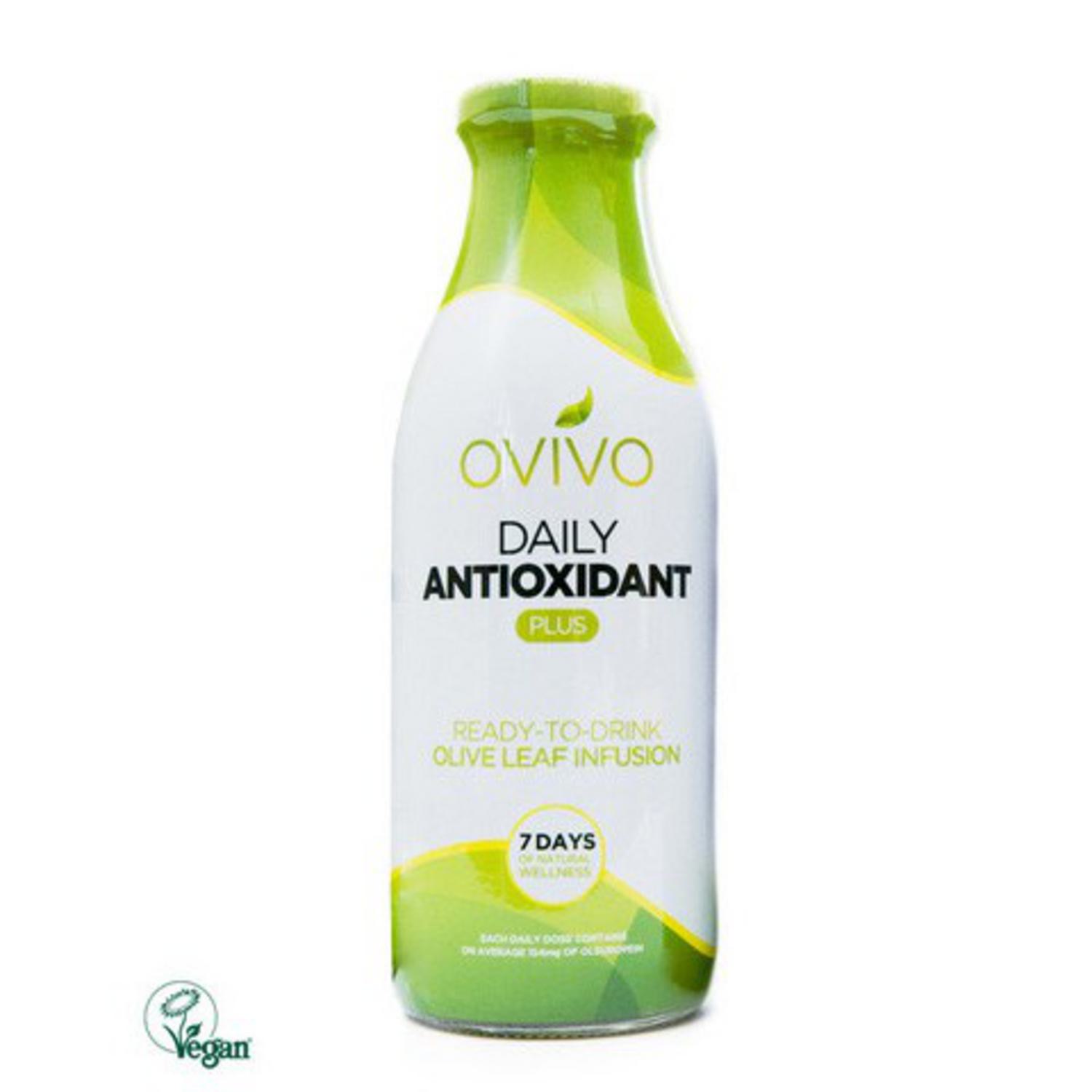
The Ovivo daily anti-oxident drink, gloss wrapping that covers the lid to ensure that the drink has not been opened prior to purchasing... will create an overall opaque bottle!

http://www.thedieline.com/blog/2010/9/16/jack-daniel-s-mr-jack-160th-birthday.html
http://www.thedieline.com/blog/2010/9/16/jack-daniel-s-mr-jack-160th-birthday.html
Vacuum packed bottle wrap sticks to the shape of the bottle without leaving loose areas wlong the plastic.
lllllllllllllllllllllllllllllllllllllllllllllllllllllllllllllllllllllllllllllllllllllllllllllllllllllllllllllllllllllllllllllllllllllllllllllllllllllllllllllllll
No comments:
Post a Comment